I’m developing a new iPhone application. Part of the application needs a “filter a list of things” view. I’ve been looking at Apple’s approach for inspiration, most notably the Contacts application. I’ve come to the conclusion that the Contacts approach absolutely sucks, and so I’ve developed my own custom interface instead. This article describes the problems with Contacts, and the alternative approach that I’ve implemented for my own application.
Why Contacts sucks
I’m going to try and find my friend Ben Pickering in the iPhone’s “Contacts” application. (I could equally have gone into the “Phone” application and selected its “Contacts” screen – the interface is the same.)
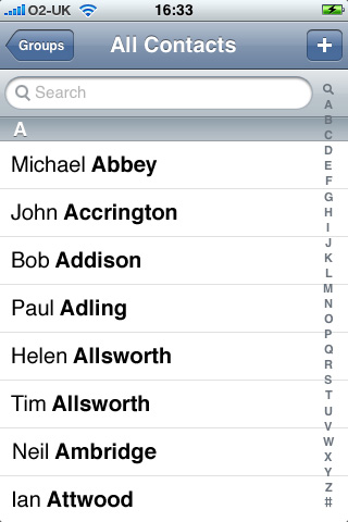
Here’s the default screen when I launch Contacts:
I can scroll the list of contacts by flicking the screen in the usual way, and I can use the index on the right to skip down to surnames starting with a different letter.
It’s not immediately obvious that I can click on someone’s name to view his or her contact details. Rows should have disclosure indicators (a small “>”) if they show more detail in a new screen when clicked. There are no disclosure arrows here, because they would clash with the A-Z index on the right-hand side.
This exposes an unfortunate compromise in the iPhone Human Interface Guidelines(iPhone dev membership needed):
“The disclosure indicator element is necessary if you’re using the table to present hierarchical information. This is because users know that this element means ‘show the next page of information.’ It should appear to the right of every list item that contains a sublist of items.”
…but…
“Avoid using table elements that display on the right edge of a table (such as the disclosure indicator) in a regular table with an index view, because these elements interfere with the index view.”
I guess it avoids the interface becoming cluttered. Nonetheless, it doesn’t make it clear that I can click on the names, which will become important later on.
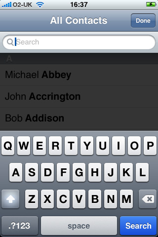
With several hundred contacts in my address book, I almost always choose to search rather than scroll. To do this, I click in the search box at the top. Here’s what I get:
The first thing to notice is that the full contacts list is still visible, greyed-out in the background, but I can’t click on items in the list. Clicking in this greyed-out area just makes the keyboard disappear, and doesn’t select the contact. The message this sends is “don’t click on this bit”. So I won’t.
The next thing to note is the presence of a “Done” button at the top right of the screen. This has replaced the previous “Add a new contact” (“+”) button, suggesting that “Done” is an integral part of the searching mode. It’s reasonable to assume that the “Done” button can be used to dismiss the keyboard.
Finally, you can’t help but notice the big blue “Search” button on the keyboard. On the iPhone, a blue button on a keyboard means “Go and do something”, with a verb as a definite call to action. For example: “Go” in Safari’s address field, or “Google” in Safari’s Search field. (Yes, “Google” is a verb these days.)
If ever that bottom-right-hand location is used for some other kind of button (such as in a “type some multiline text” view, as in Notes), the button usually says “Return” (for a carriage return), and is grey, not blue.
It seems slightly strange that this button is blue when I haven’t yet entered any text. Does this mean I can search for “nothing”? Either way, the button is all blue and verby. So let’s try and press it. Here’s the view after doing so:
Look familiar? It should do – it’s the same image as before. That search button doesn’t do anything right now.
Let’s give Contacts the benefit of the doubt. Maybe it didn’t do anything because I haven’t entered anything to search for.
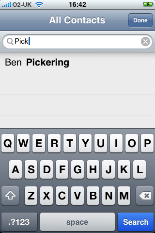
So, let’s try entering a search term. Here I am trying to find Ben.
All I’ve done here is to type in the word “Pick”. I certainly haven’t clicked on the Search button. And here’s the fundamental problem. I’m not really searching at all – I’m filtering. “Search”, in the modern-day Internet sense, means “enter some text, click a button, and get some results back”. That’s the Google-esque approach to “search the web”. Modern search engines (Google included) might give me some quick feedback as I type my search phrase, in the form of an auto-complete “do you mean” list, but when I finally “search” it’s a definite “go away, search, and bring back the results” process. In this case, I’m not search-and-retrieving, I’m filtering a long list of things into a shorter list of things, and that filtering happens the instant I type some filter text.
Just to check, though, let’s try pressing that big blue Search button again. Here’s what happens:
Again, this may look rather familiar. That big blue button has done absolutely nothing at all. In fact, at no point in the process does that Search button do anything. It doesn’t even dismiss the keyboard. It just sits there being pointless.
An extra note: the list section is slightly greyed out, and the search bar has a drop shadow, which makes the search bar appear to be in front of the list of names. This suggests that the search bar is somehow more important than the list of names, which just serves to make them feel less important and therefore less selectable. (More on this later.)
I’ve now filtered my list of contacts to only show Ben Pickering. There’s still no obvious disclosure arrow next to Ben’s name to suggest I should click on his name to see his contact details, even though the A-Z index disappeared when the keyboard appeared. The most obvious action instead is to click on that “Done” button, to exit the search mode and get rid of the keyboard. Here’s what happens when I do so:
Woah! What happened there? My filter has gone, and Ben is nowhere to be seen!
Clearly this isn’t great, and I have decided not to adopt this approach to filtering in my own application.
Searching in iTunes
As an alternative, I looked at the search functionality found in the iTunes and App Store applications. “Search” in iTunes means “search for music to download or buy”. In the App Store it means, “search for applications to download or buy”.
(I also looked at the iPod application, but it doesn’t contain a “search” feature, unlike the iTunes application on a Mac or PC. This is particularly annoying if you have many hundreds of songs on your iPhone. It’s worth noting that if it did have a similar feature to iTunes on Mac or PC, it would actually be a filter, not a search.)
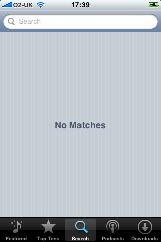
Here’s the default iTunes search screen:
If we click in the “Search” box:
No search text has been entered, so the search button is greyed out. Much better.
Let’s try searching for songs by The Charlatans:
Two things have happened here. Firstly, the “Search” button has turned blue, suggesting that a search action is now available. Secondly, a list of possible matches has been retrieved (over the network) from the iTunes Store, and shown below the search box. The background colour of the list is again slightly off-white, which is a little confusing – does it mean I can’t click them? The phrases in the list don’t have a disclosure indicator, which suggests that they are not clickable. Nonetheless, the fact that they have appeared where previously a message said “No matches” makes me think that they have been retrieved for a reason, and that reason can only be for me to click on them.
In this case, I’m definitely not filtering – I’m searching, in the Google sense. It helps that the data I’m searching is on a remote server, so there’s a time lag (with associated spinning icon in the toolbar), giving a time-delay clue that a search is being performed on my behalf.
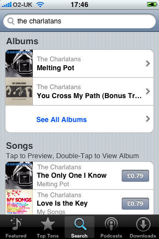
If I click on one of these suggested phrases, here’s what happens:
The selected phrase is automatically placed in the search box. The keyboard disappears, and after a short delay, all matching albums and songs for the search phrase “the charlatans” are retrieved. That was definitely a search (even though I didn’t click the blue Search button). The iTunes search suggested some phrases I might be looking for, and when one was selected, it used that phrase to seed a full search.
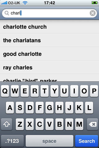
What would have happened if I had clicked the search button? Here’s where we were:
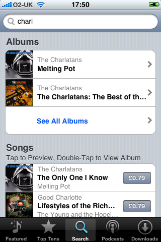
…and here’s what happens if I click on the “Search” button:
It’s the same search approach as before, but just using the short phrase I’d entered (“charl”) rather than one of the suggested phrases (“the charlatans”). Songs by Good Charlotte are in the list too. (The App Store application uses exactly the same approach.)
When I entered a search term, the contents of the list below the search box were suggestions, not search results. This explains the drop shadow and the slight greying out of this middle list – they are not as important as the search box itself, but exist to provide a shortcut to possible searches. This is very different to the Contacts app, where the items in the list are the actual “search” results.
The iTunes approach is definitely much better than the Contacts approach, but it’s not what I need for my application, and it’s not what Contacts needs either. This is a “search and retrive” metaphor, and what both my application and Contacts need is a “filter a big list” metaphor.
The problem with UISearchBar
So why does the Contacts app make such a hash of it all? The problem lies in the underlying iPhone SDK widget used by both applications. This widget, known as a UISearchBar, provides a ready-made search bar control with text-change events and several customisable options. It’s a quick way to add search functionality to an iPhone app.
The problem is, UISearchBar is designed for searching, not filtering. Here’s what the documentation has to say about UISearchBar:
“The UISearchBar class implements a text field control for text-based searches. The control provides a text field for entering text, a search button, a bookmark button, and a cancel button. You use a delegate, an object conforming to the UISearchBarDelegate protocol, to implement the actions when text is entered and buttons are clicked. The UISearchBar object does not actually perform any searches.”
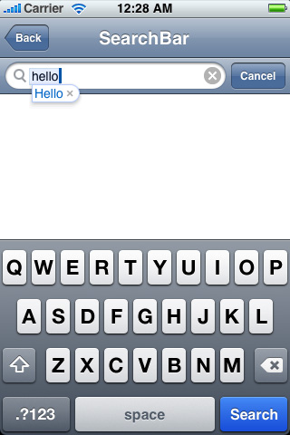
Here are two shots of UISearchBar in action (without a data source to search):
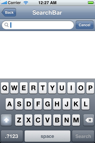
The left-hand image shows the UISearchBar with no search text is entered. The right-hand image shows the UISearchBar with a search term entered. The cancel button is optional, as is the auto-complete functionality. Your code can receive events when the text changes; when the search button is clicked; or when the cancel button is clicked. There are a few other customisation options too.
(Note that in the images above, UISearchBar has disabled the blue Search button when no text is entered, which is different from the Contacts behaviour. This may mean that Contacts is using its own custom search control instead of UISearchBar. UISearchBar doesn’t implement the drop shadow or greying-out either, so Contacts must be doing this itself too.)
In either case, UISearchBar is no good for filtering, simply because there’s no way to change that Search button to say something else. You can change the keyboard type (to be a number pad, for example), but you can’t change to a text keyboard with a different “action” button.
You can make the Search button (or the optional Cancel button) hide the keyboard. But this still doesn’t help for filtering, as seen above in Contacts. What you really need is to use the UISearchBar’s text change events to filter the list, without the need to have a “Search” button at all. That Search button is always going to confuse the user when filtering.
It looks as though Contacts has taken its interface design lead from iTunes and App Store, using a souped-up take on UISearchBar. Unfortunately, it simply isn’t searching in the same sense.
An alternative interface for filtering
In the end, I created a custom filtering interface for my own application. I’ve mocked up how this could be used for the Contacts application too.
On the left is how my filtering interface would work in Contacts. On the right is how Contacts does it now.
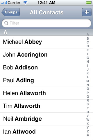
In the new version, the filter box is an integral part of the view’s header, rather than being part of the scrolling view. Given that the filter box doesn’t take up much space, this is less confusing than having a filter box that disappears when the view is scrolled.
(Strictly speaking, the filter box doesn’t have to be an integral part of the navigation bar across the top, as in my mock-up above. It could sit just under the navigation bar as a separate row in its own right. The important thing is that it doesn’t scroll away when the list is scrolled. Given that it doesn’t scroll, I prefer to have it integrated into the navigation bar, as this gives an explicit visual cue that the filter box position is fixed.)
The filter box contains the placeholder text “Filter” rather than “Search”. It is still styled as a curvy-ended box, with the magnifying glass icon, as this metaphor indicates to the user that something needs to be found. The “Filter” placeholder text makes it clear that a filter action (rather than a search action) will take place when text is entered.
If I click in the filter box:
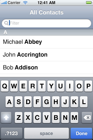
The standard keyboard is displayed, but its action button is a “Done” button. The “Done” button is always active, even when no text is entered in the filter box. Clicking “Done” will always hide the keyboard.
The “Groups” and “+” buttons disappear (with a fade out animation) when the keyboard appears, as they are not part of the filtering process. The A-Z index also disappears when the keyboard is displayed.
The centre part of the screen is not masked in dark grey. It is possible to select someone from the filtered list at any time during the filtering. For consistency, and to reinforce this from the beginning, the list is visible and selectable (and scrollable if appropriate) even when no filter text is entered. Choosing a name from the list would hide the keyboard and progress to the next screen in the process (the “Info” screen for a contact in this case).
When I enter some text in the filter box:
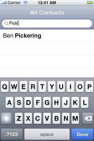
As I enter the text, the list is filtered to only show matching contacts. Note that the centre section does not have the slight “greying out” of the current Contacts app, nor the drop-shadow under the search bar. This is to indicate that the contacts are just as selectable as when the keyboard is not displayed. It also reinforces that you are viewing the actual “search results” – in this case, the filtered list of contacts.
The first-letter section headings are not displayed whenever a filter string is present, even if that filter string is only one character long.
When I click the blue “Done” button on the keyboard:

The keyboard disappears, and the “Groups” and “+” buttons return (with a fade in animation).
The list remains filtered, and my filter string (“Pick”) is clearly displayed and does not disappear even if the list is scrolled (assuming that scrolling were appropriate, i.e. if more than a screenful of people had matched the filter string). This makes it clear that a filter is in place.
I can always click back into the filter box and clear the filter string (using the white-on-grey circular cross icon to clear the text) if I want to display the whole list again.
I considered adding in disclosure indicators when the A-Z list is not visible, but in the end I decided to follow the iPhone Human Interface Guidelines approach mentioned above for consistency with other iPhone applications. I also feel that a clearer filtering metaphor, with a consistent presentation of the list when filtering, makes it more obvious that items exist to be clicked.
TableSearch Sample
A small footnote: since writing this article, I have discovered that Apple actually provide a sample code project, called TableSearch, which…
“…demonstrates how to search the contents of a UITableView using UISearchBar, effectively filtering in and out the contents of that table. If an iPhone/iPod Touch application has large amounts of table data, this sample shows how to filter it down to a manageable amount if memory usage is a concern or you just want users to scroll through less table content.”
This sample application works much like my suggested approach, and nothing at all like the Contacts application. It has a few problems – it doesn’t resize the list’s table view when the keyboard appears, so the list scrolls behind the keyboard (which isn’t nice). Also, clicking “Search” still doesn’t actually perform a search – the list is already filtered; clicking the Search button just dismisses the keyboard. Crucially, though, it leaves the filter text in place once the keyboard is dismissed. You can then click in the search box to clear the filter text if needed.
On the evidence of TableSearch, it seems as though Contacts doesn’t even follow Apple’s recommended approach for filtering a list.
Changing UISearchBar’s action button
Another footnote. I’ve just discovered that Erica Sadun’s The iPhone Developer’s Cookbook describes a way to change the Search button for the keyboard associated with UISearchBar. This involves accessing the UISearchBar’s subviews until you find the UITextField used for the actual search field, and changing its keyboard return key type. The sample code for the book can be downloaded from Google Code – you’re after C08 – Controls.zip. Open the “10a – Searchbar” project from inside this zip file.
The code goes something like this (where search is a UISearchBar instance):
UITextField *searchField = [[search subviews] lastObject];

[searchField setReturnKeyType:UIReturnKeyDone];
It would be better to check each of the UISearchBar’s subviews and check their class to see if they are a UITextField, rather than assuming that the last subview will always be the UITextField, but the idea is a good one nonetheless. And I do like Erica’s summary on the subject:
“…don’t let Apple’s preconceived notions about how a control should be used stand in the way of using it the way you think you should. If “search” doesn’t describe what users need to do at the end of an interaction, switch the Return button to a better phrase that does.”
