Publishing has had many saviours in recent years. Apple, Amazon and Google have all been touted as potential messiahs by an industry desperate to work out its role in an uncharted digital world.
Big technology companies haven’t been the only saviours. Small independent producers such as Touch Press.com and Inkling.com have experimented with the boundaries between books and apps, with interesting results.
Today sees another entry into the Future of Publishing, launched with considerable fanfare by Al Gore and Push Pop Press. Our Choice, the sequel to 2006’s An Inconvenient Truth, claims it will “change the way we read books, and quite possibly change the world.”
Content overview
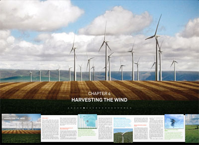
Much of Our Choice is to be commended. Its display of chapter headings and page overviews is beautifully crafted. I’d prefer a single-finger swipe to load a specific page – pinching the pages is a little clunky, especially on an iPhone – but as a way of displaying an overview of the content, the two-layered approach works very well. And the ability to start reading while the rest of the book downloads is so well implemented, you probably won’t even notice it’s happening.
Page layout
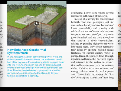
The layout of individual pages has several nice touches. My favourite is the way photos and videos break out of the horizontal page boundary, giving them immediate affordance for interactivity. Showing photos on a world map is a very neat touch, although an oppportunity is missed by not showing an explorable overall map for all photos in the book. Continuing to play videos inline is also a neat touch.
I’m not sure about showing the previous and next pages at the sides of the page – this distracts from the current page’s readability, and (with two exceptions) there will alwaysbe a previous and next page, so no extra information is given by their inclusion. Much better would be to give a visual indication of overall progress through the chapter or book; right now there’s no progress indication at all.
Interactivity
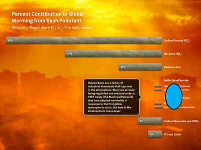
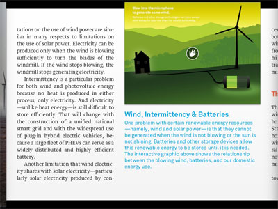
Beyond photos and movies, the interactive page elements provide much of the innovation in Our Choice. They are, however, something of a mixed bag. Some, such as the “Solar Power Density” map, are superbly executed. Others suffer from positioning important information behind the user’s finger. This leads to a strange finger dance as you try and reveal the detail, while also reading the text it discloses. (The image below shows this problem – the blue oval indicates where my sausagey finger was positioned when the screenshot was taken.)
In addition, many of the interactive elements only show details whilst a finger is held down. This can make animations and details less comfortable to read.
Typography
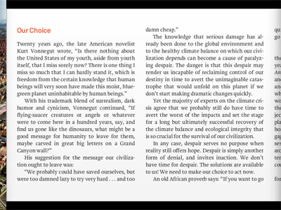
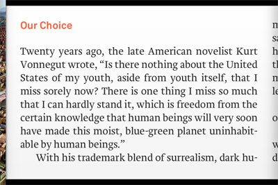
Where the app disappoints is in its use of typography. Starting with orphan and widow control, the first page of the iPad edition has a widowed line that no book publisher would allow:
The same page on iPhone has an easily-avoided orphan:
Given that the overall text size cannot be adjusted – a problem in itself for visually-impaired users – basic widow / orphan control would make a big difference to text readability in the app.
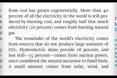
The app uses a carded approach for page progression, which in many ways is preferable to free-scrolling when laying out so many competing elements. However, one of the responsibilities of a carded approach – indeed, one of the main reasons for using it – is to ensure that your content’s layout is tailored to fit each card’s available space, for the best reading experience possible. The app doesn’t take this approach, resulting in some awkward pagination choices.
This problem is exacerbated on iPhone, where most pages contain the end of the previous paragraph, and the start of the next – despite the fact that nearly all paragraphs are approximately one screen in length. There’s an ideal opportunity here to make each ‘page’ a self-contained paragraph or chunk of content, but sadly it hasn’t been taken.
The app’s use of full-screen images further complicates this problem. The full-screen images are fine in themselves, but the way text is formatted and paginated causes them to break the reader’s flow mid-sentence.
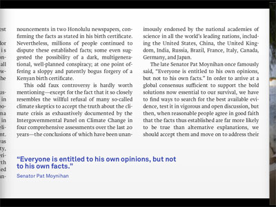
Take this example from the app’s introduction. The last paragraph on this page finishes: “and move on to address their…”
You then page forward to a stunning photo of Pakistan flooding. Quite possibly you tap the map icon to view this photo on a map.
You then swipe to the next page to continue reading, only to find the last word of the previous paragraph at the top of the new page (“…implications.”):
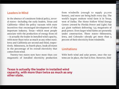
Another example of how layout can disrupt the flow of the text. This example splits the word “limitations” in two, starting with “limi-”
…followed by four full-screen photos…
…followed by “tations”.
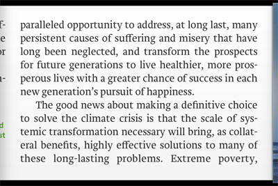
There are other problems. The use of hard-justified text, and aggressive hyphenation, makes the body text hard to read, especially on iPhone:
There are issues with kerning too, especially on the pullout font for inserts. All of these issues mean that the text reading experience is something of a disappointment when compared to the interactive elements of the app.
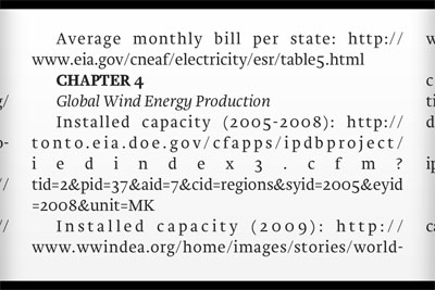
One final note: the iPhone version of the app contains 125 pages of credits, but the URLs are neither copyable nor openable in Safari. This is a shame, and an opportunity missed for reading further on the subject.
Summary
The natural form for digital content is still being discovered. Experiments such as Our Choice are essential to drive forward this understanding, and to define the standards for publishing on these new devices. Our Choice makes for a richer digital publishing world, and the authoring tools behind it will win friends with publishers and authors looking for cost-effective ways to bring content to iDevices. But until typography gets the attention it deserves, and can be made to integrate seamlessly alongside interactivity, Our Choiceremains a step removed from the digital publishing ideal.
With thanks to Alyson Fielding for additional thoughts and comments.
